Skip to content
Modern Screenplay Logo Modern Screenplay

The Art & Craft of Great Screenwriting

Modern Screenplay Logo
Modern Screenplay

The Art & Craft of Great Screenwriting

Q. What If I Don’t Have Final Draft?

Charlotte, April 19, 2024April 20, 2024

As someone who has used Final Draft forever, I first want to say that it’s an incredible program, and one that has made the sometimes-painful act of screenwriting much easier.

I highly, highly, highly recommend that you make the investment to get it – you will not regret it. 

But what if Final Draft is cost-prohibitive?

I get it – we’re in inflationary times, and money can seem tight. If that’s the case, here’s how you can format the average document. (Please note that this is for 8.5″ X 11″).

Here are the specifications to use for Word:

  1. Use 12-pt. Courier. 
  2. Sluglines and action lines should start 1.5” from the left edge of the paper. 
  3. Character names should start at 3.7” from the left edge of the paper.
  4. Dialogue should start at 2.5” from the left edge of the paper; it shouldn’t extend beyond 6.5” from the left edge of the paper.
  5. Parentheticals should start at 3.1” from the left edge of the paper; they shouldn’t be wider than 2” in total width. 
  6. The right margin for all of these should be ½” to 1.25” – no need to justify it; keep it ragged. 
  7. Top and bottom margins should be 1” each. 

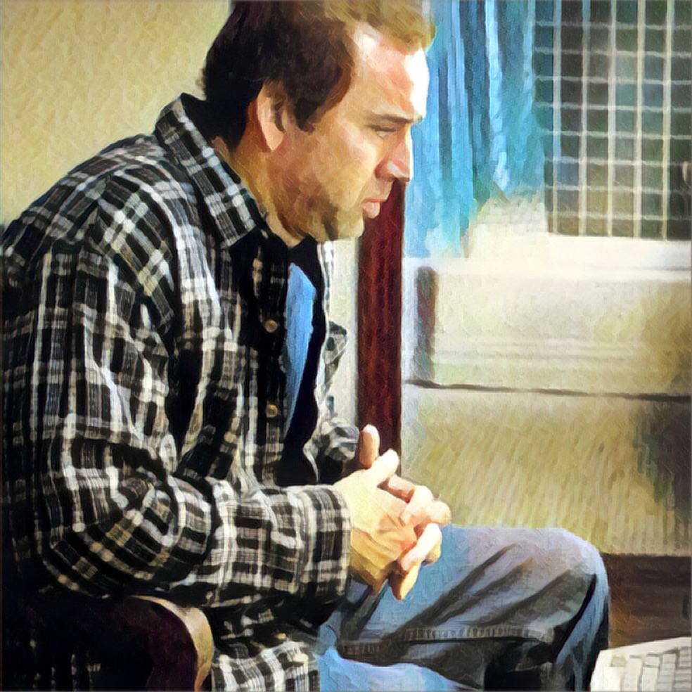
Let’s Look at an Example from Adaptation:

I tried unsuccessfully to upload PDFs to Canva so that I could label all of the margins. (It did not go smoothly).

So allow me to point out what’s going on.

  1. We can see that 12-pt Courier is in full effect. 
  2. The action lines and the slugs start from 1.5” from the left edge of the paper. 
  3. Note how character lines start from 3.7” from the left edge of the paper.
  4. Dialogue starts at 2.5” from the left edge.
  5. Note how parentheticals start at 3.1” from the left edge of the paper.
  6. See how, on the right, nothing goes past 1.25” (esp. with the action lines).
  7. Finally, the top and bottom are 1” inch each.

I wouldn’t worry about page numbers, the asterisks marking revisions on the righthand side, the scene numbers or the “(Continued)”s. All of these are extraneous.

Hope this helps!

Formatting Fridays

Post navigation

Previous post
Next post

Related Posts

Formatting Fridays

Q. How to Format Tech Conversations?

January 26, 2024February 21, 2024

As film has evolved, so has tech and the world around us; thirty years ago, we didn’t have the issue of formatting text/email conversations. So, as you watch films and see little graphics come up that show what characters are texting or emailing to each other, you may wonder, how…

Read More
Formatting Fridays

Q. How to Format Phone Conversations?

February 2, 2024February 21, 2024

Last week, we covered the basics of how to cover texting.  This week, we’ll cover phone conversations, and there are several different ways you can do it.  For this post, I’m sharing an excerpt from Dave Trottier’s The Screenwriter’s Bible (pages 301-303), an excellent resource. (Please note that the below…

Read More
Formatting Fridays

Q. How to Introduce a Character for the First Time?

January 12, 2024March 26, 2024

As this is the first in this series addressing formatting issues, I thought it would be appropriate to address how to introduce a character for the first time. Here are some do’s and don’ts. Do’s: Don’ts: But if we’re not supposed to name actors, how does Barbie get away with it?…

Read More

About Me

Charlotte Winters

Hi, I’m Charlotte Winters. As an award-winning screenwriter with an MFA from UCLA who associate produced a show on behalf of The History Channel, lectured at UCLA, and freelanced at WB and FX, I am a lifelong student of the screenplay. I founded this blog because I love reading and analyzing great movies.

Search this Site

      ©2026 Modern Screenplay | WordPress Theme by SuperbThemes